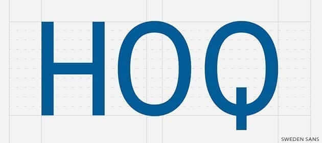
Sweden Sans Becomes First National Font Ever
Swedish designers were given the task of creating a national font and they called it Sweden Sans.
A design agency in Stockholm was commissioned to create a typeface to be used by the Swedish government and corporations. Taking national identity to the next level.
Sweden Sans and Lagom
The designers were handed a brief to come up with a new font that would replace the various ones used on the sites of government ministries, agencies and corporations. The idea is to integrate the nation’s public information into one visual brand identity. The font had to be “fresh and dynamic”, representing Sweden to the world.
For one designer, “it was a big responsibility to be representing our country, but we were really proud to be asked,” said Stefan Hattenbach from the Söderhavet design agency in Stockholm. “Aesthetics are very important in Sweden and we have a long tradition of great architecture, furniture and design — so this was the natural next step.”
Joined with him was head of design at Söderhavet, Jesper Robinell; “we started to think about how it would work with different typefaces, then started mood boards with different fonts and pictures – especially of old Swedish signs we’d seen from the 1940s and 50s.” The pair started looking at the Swedish national flag, that yellow Scandinavian cross against a bright blue background (used since the 1600s). Combining their sketches with modern electro music, to disco and even Bob Marley.
After about six months of designing, they had drafted a modern, geometric font based on the normal sans-serif but with a few stylish tweaks to it.
“We have an expression in Swedish, lagom,” states Robinell, “which means ‘not too much and not too little,’ something in the middle that means you’re content. We Swedes are happy with that. And lagom is what we’ve aimed for with Sweden Sans.”
“We have an expression in Swedish, lagom […] which means ‘not too much and not too little,’ something in the middle that means you’re content. We Swedes are happy with that. And lagom is what we’ve aimed for with Sweden Sans.”
The Q
Both pointing out that they’re really pleased with the look of the letter Q, in particular. “It has a tail,” they mention.
“It’s all about Scandinavian minimalism. If they notice the typeface too much, it hasn’t worked.” The agency has also received other design briefs from other countries looking for something similar, but they didn’t go into detail: “We can’t name names,” Hattenbach states, “as the projects are still in their first phases, but we’re currently ‘in discussions’ to do much more nation branding in future.”
We love the new Sweden Sans font and the idea behind it. What are your thoughts on it, and a nation having a brand identity?
Source: The Guardian

